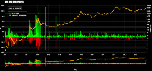
Quarterly Price Performance
Quarterly returns of BTC. Yellow line is closing price at quarter end. Red and green lines show percent gain or loss.
Data & charts updated every hour
This is a fairly simple chart. Here we utilize a standard candle chart with a Bitcoin price open, high, low, and close, with the one difference being that there is only one candle for each year of Bitcoin’s existence. This chart is a great way to get the basic information on the Bitcoin price for each year quickly and easily.
We take a look back at each year and display the highest price and the lowest price. We also look at the first price record on January 1 of that year for the open, and the price on December 31 of that year for the close.
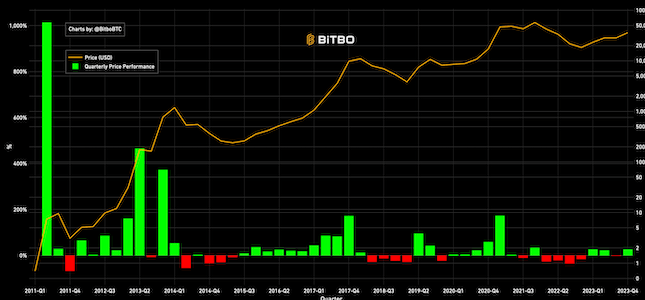
Quarterly returns of BTC. Yellow line is closing price at quarter end. Red and green lines show percent gain or loss.
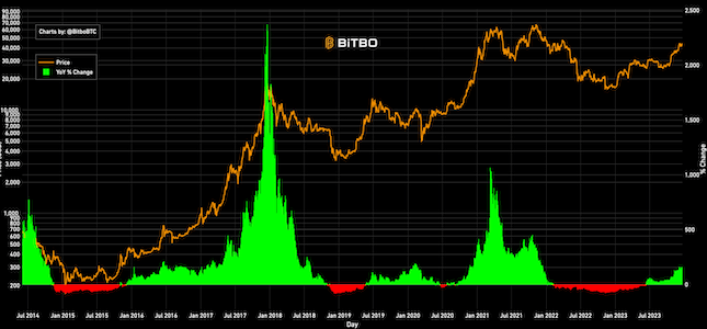
Shows the price of Bitcoin and its year over year price change.
Shows Bitcoin's entire price history. Daily change in price is shown in red/green under the chart.
Bitbo's charts section offers a wide range of Bitcoin charts and metrics.
If you have any questions, comments, or feedback please reach out to us via Twitter or via email at info@bitbo.io.