
Bitcoin Rainbow Chart
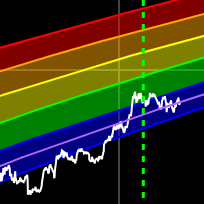
A Bitcoin rainbow chart using only the halving dates as data.
Data & charts updated every hour
This chart compares the daily Bitcoin purchases by US spot ETFs against the daily new Bitcoin supply from mining. The green line shows the raw daily ETF purchases, while the gold line shows the raw daily new Bitcoin mined each day. This helps you see how ETF demand compares to new supply on a daily basis.
The ETF purchases line represents the net daily Bitcoin acquisitions by all US spot ETFs, excluding the initial GBTC holdings that existed before the ETF launch. The new Bitcoin supply line shows the daily mining rewards, which is approximately 450 BTC per day (though this varies slightly due to mining difficulty adjustments).
The chart displays raw daily values as the primary view, with 7-day moving averages available in the legend for users who prefer smoothed data to reduce daily volatility.
When the green line (ETF purchases) is above the gold line (new supply), it means ETFs are buying more Bitcoin than is being created through mining. When the lines cross or the gold line is higher, it indicates periods where new supply is outpacing ETF demand.
This chart includes several additional data series that are hidden by default but can be toggled on using the legend controls:
To view these additional series, simply click on their names in the legend below the chart. You can toggle multiple series on and off to compare different aspects of the data.
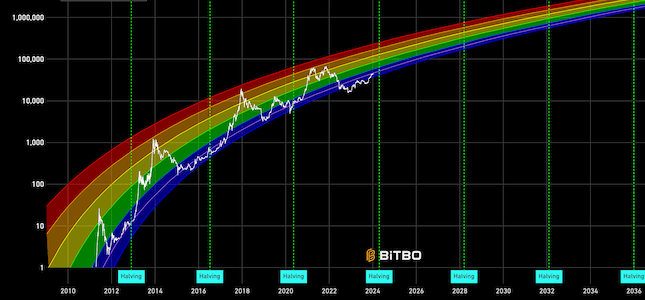
A Bitcoin rainbow chart using only the halving dates as data.
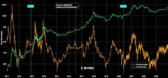
Shows the relation between BTC mined in a day (expressed in USD) and 365 day moving average.
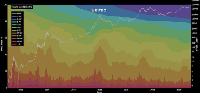
Visualizes the age distribution of Bitcoin's circulating supply over time.
Bitbo's charts section offers a wide range of Bitcoin charts and metrics.
If you have any questions, comments, or feedback please reach out to us via Twitter or via email at info@bitbo.io.