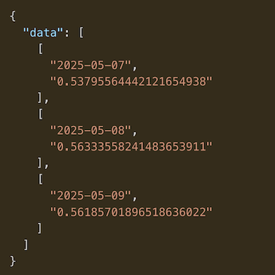
MVRV Z-Score
A chart showing Bitcoin's historical MVRV-z score.
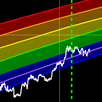
This chart shows the distribution of Bitcoin supply across different age bands as percentages of the realized market cap. Each colored band represents Bitcoin that has been held for a specific time period.
The realized cap is calculated by multiplying each UTXO by the price at which it was last moved, providing a more accurate representation of the actual capital invested in Bitcoin.
HODL Waves help identify market cycles - high percentages in short-term bands (red/pink) often indicate active trading and potential market tops, while high percentages in long-term bands (blue/purple) suggest strong conviction and potential market bottoms.
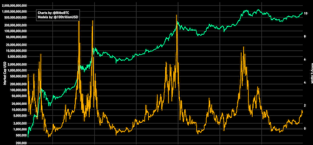
A chart showing Bitcoin's historical MVRV-z score.
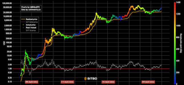
Realized price is the realized market cap divided by total amount of generated coins.
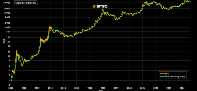
Shows the short term holder realized price and the price of Bitcoin.
Bitbo's charts section offers a wide range of Bitcoin charts and metrics.
If you have any questions, comments, or feedback please reach out to us via Twitter or via email at info@bitbo.io.