
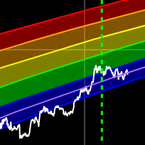
Bitcoin Rainbow Chart
A Bitcoin rainbow chart using only the halving dates as data.
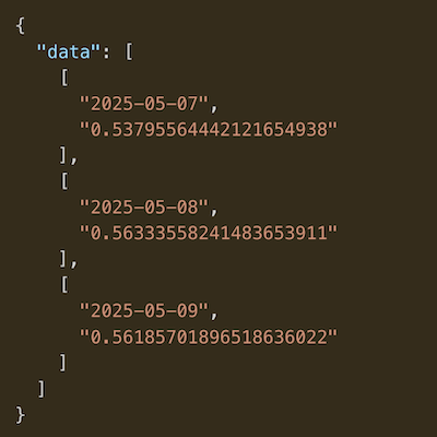
Data & charts updated every hour
- Ancient Supply: The total amount of Bitcoin that has not moved for at least 10 years.
- Total Supply: The total number of Bitcoin in existence at any given time.
- Ancient Supply %: The percentage of the total supply that is considered "ancient" (unmoved for 10+ years).
Chart Description
- The green area shows the absolute amount of ancient Bitcoin supply (in BTC) over time.
- The blue line represents the ancient supply as a percentage of the total supply, scaled for comparison.
- The orange line displays the total Bitcoin supply.
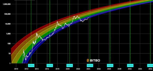
A Bitcoin rainbow chart using only the halving dates as data.
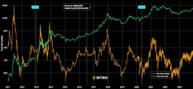
Shows the relation between BTC mined in a day (expressed in USD) and 365 day moving average.
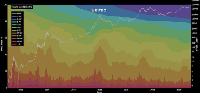
Visualizes the age distribution of Bitcoin's circulating supply over time.
Bitbo's charts section offers a wide range of Bitcoin charts and metrics.
If you have any questions, comments, or feedback please reach out to us via Twitter or via email at info@bitbo.io.