
Bitcoin Mining Difficulty
Historical mining difficulty. Shows green if the difficulty went up and red if it went down, compared to previous epoch.
Data & charts updated every hour
Chart Starting from: |
|
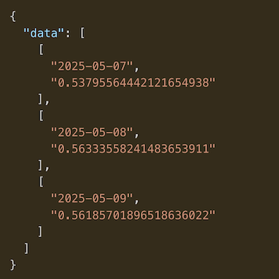
This chart visualizes the average percentage change in Bitcoin's price for each day of the week since a selected starting year. By aggregating historical performance, it identifies recurring trends and helps identify which days have historically been the most bullish or bearish.
The Daily Returns chart is a powerful tool for identifying "Day-of-the-Week" effects. While past performance does not guarantee future results, This Data can be used to:
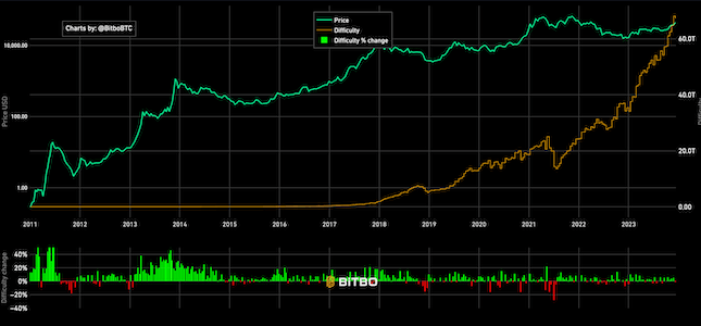
Historical mining difficulty. Shows green if the difficulty went up and red if it went down, compared to previous epoch.
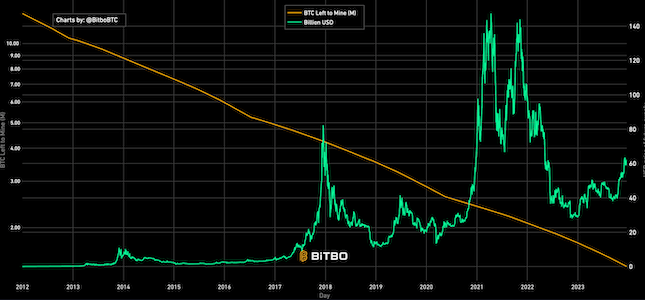
Shows the USD value of the future outstanding Bitcoin supply that has not been mined.
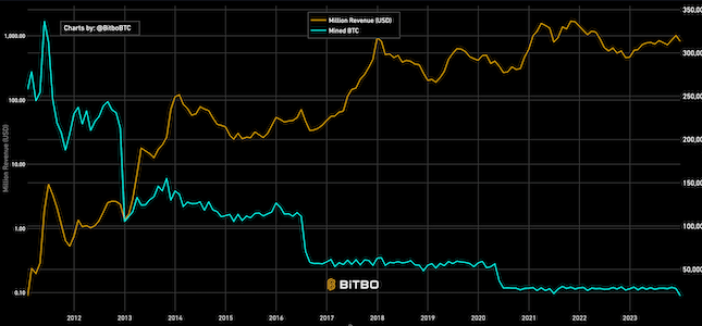
Shows the amount of revenue earned monthly by miners in USD and BTC.
Bitbo's charts section offers a wide range of Bitcoin charts and metrics.
If you have any questions, comments, or feedback please reach out to us via Twitter or via email at info@bitbo.io.