
NASDAQ Priced in Bitcoin
Shows the NASDAQ Composite index priced in Bitcoin.
Data & charts updated every hour
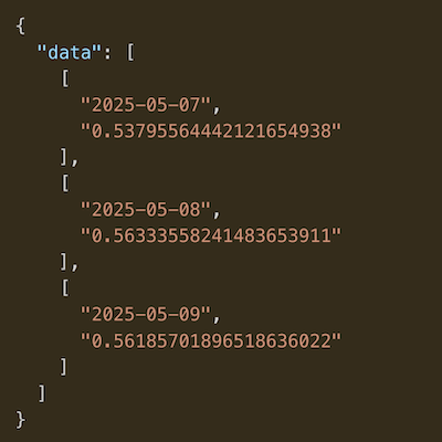
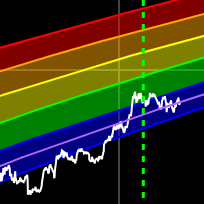
The upper panel shows BTC price (orange, left axis) and the S&P 500 index (blue, right axis), both on a logarithmic scale.
The lower panel shows the rolling Pearson correlation between BTC and the S&P 500 using daily closing prices, sharing the same time axis.
The 50-day correlation is shown by default to capture short-term shifts. Toggle the 200-day correlation on from the legend to reveal longer-term structural trends.
When the correlation sits high and positive (above ~0.6), Bitcoin is trading like a high-beta risk asset — moving in step with equities as global liquidity drives both. When it falls toward zero or negative, BTC is decoupling and trading on its own crypto-specific drivers rather than broad market sentiment.
Sustained stretches above zero point to a risk-on, liquidity-driven regime, while dips below zero highlight periods where Bitcoin moves independently of — or against — the S&P 500.
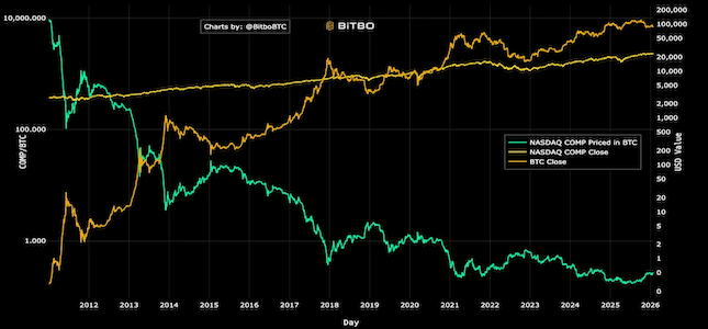
Shows the NASDAQ Composite index priced in Bitcoin.
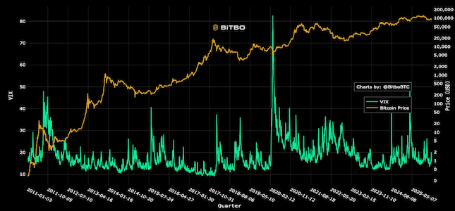
Compares the VIX volatility index with Bitcoin price.
Bitbo's charts section offers a wide range of Bitcoin charts and metrics.
If you have any questions, comments, or feedback please reach out to us via Twitter or via email at info@bitbo.io.