Close sidebar
-
S2F Bands Pro
Close sidebar
-
Revived Supply Pro
-
Market Cycles Pro
-
STH SOPR Pro
-
LTH SOPR Pro
-
SOPR Ratio Pro
-
STH NUPL Pro
-
LTH NUPL Pro
-
MVRV Bands Pro
Close sidebar
-
50 MARP Momentum Pro
Close sidebar
-
CAGR Scenarios Pro
Close sidebar
-
50 MARP Pro
Close sidebar
Close sidebar
Close sidebar
-
ROI From Peaks Pro
-
Yearly ROI Pro
Close sidebar
Close sidebar
-
Stocks vs BTC Pro
-
MSTR-BTC Ratio Pro
Close sidebar
Close sidebar
Close sidebar
Close sidebar
-
MVRV Crosses Pro
Close sidebar
Close sidebar
-
Supply In Profit Pro
-
Ancient Supply Pro
Close sidebar
-
MSTR BTC/Share Pro
-
MSTR Nav Premium Pro
Close sidebar
Close sidebar
-
4y Comparison Pro
-
DXY vs BTC Pro
-
SP500-Gold Ratio Pro
Bitcoin Cost Basis Distribution Heatmap
Data & charts updated every hour

Price update
30 minutes ago
UTXO update
30 minutes ago
Upgrade to Bitbo Pro to view this chart.
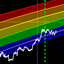
UpgradeBitcoin Cost Basis Distribution Explained
This chart combines Bitcoin's price history with a volume profile showing the cost basis distribution of all current UTXOs.
The horizontal bars on the right side of the chart show how much Bitcoin supply was last moved at each price level. The bars are colored by density:
- Cool blue = low concentration of supply
- Green = moderate concentration
- Yellow = high concentration
- Red = highest concentration of supply
Price levels with large concentrations of supply (red/yellow) can act as support or resistance zones, since many holders have their cost basis at those levels.
Disclaimer
Any information found on this page is not to be considered as financial advice. You should do your own research before making any decisions.
More Charts
×
Bitbo's charts section offers a wide range of Bitcoin charts and metrics.
If you have any questions, comments, or feedback please reach out to us via Twitter or via email at info@bitbo.io.
@
BitboBTC