
Cycle Low Multiple
Divides the bitcoin price history into eras. Each era represents the days within a block reward subsidy period.
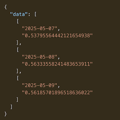
Data & charts updated every hour
Total Investment (USD)
Lump Sum: $1,461.00
Current Value (USD)
Lump Sum: $4,712.97
Current Return
Lump Sum: 222.60%
Total BTC
Lump Sum: 0.0732542
This chart allows you to backtest Bitcoin dollar cost averages.
You can set the purchase amount, frequency, and start date using the form above the chart.
Once you click submit, you will see a chart that shows four things:
1. The green line represents the Bitcoin price throughout the DCA period.
2. The orange line illustrates the current USD value of the Bitcoin you would have accumulated through your DCA strategy.
3. The light blue straight line indicates the total amount of USD you would have invested following your DCA plan.
4. Below the chart, you'll see a color indicator (red or green) that shows whether your DCA strategy resulted in a profit (green) or loss (red).
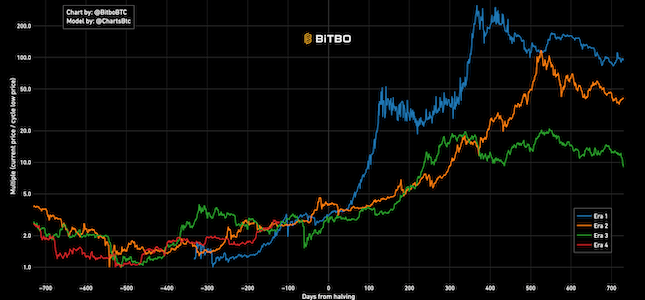
Divides the bitcoin price history into eras. Each era represents the days within a block reward subsidy period.
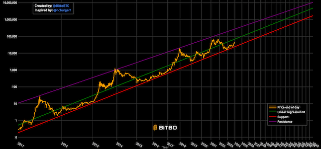
Bitcoin's natural long-term power-law corridor of growth.
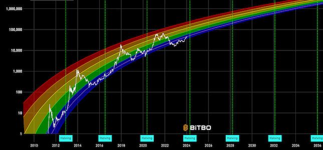
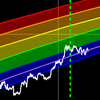
A Bitcoin rainbow chart using only the halving dates as data.
Bitbo's charts section offers a wide range of Bitcoin charts and metrics.
If you have any questions, comments, or feedback please reach out to us via Twitter or via email at info@bitbo.io.