
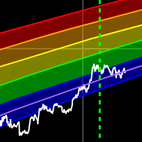
Bitcoin Rainbow Chart
A Bitcoin rainbow chart using only the halving dates as data.
Data & charts updated every hour
The visible line on this chart shows the ratio of Bitcoin held by US spot ETFs (excluding the initial GBTC amount) to the total amount of new Bitcoin mined since the ETFs launched in January 2024. This helps you see, at a glance, how ETF demand compares to new supply—a key metric for understanding market dynamics.
We remove the initial GBTC holdings from the calculation, since GBTC started with a large amount of Bitcoin that was not newly acquired for the ETF launch. The ratio reflects only the net new BTC bought and held by ETFs since January 11, 2024, divided by the number of new bitcoins mined in the same period.
There is also an option (hidden by default) to view the ratio including the initial GBTC holdings, if you want to see the full picture.
By default, only the ratio line is visible. You can also choose to display (these are hidden by default):
If ETF demand consistently outpaces new supply, it can create additional scarcity in the market, potentially impacting price dynamics. This chart helps cut through the noise and shows, in concrete terms, how much ETF demand is outstripping new Bitcoin creation.
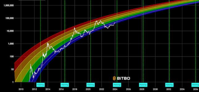
A Bitcoin rainbow chart using only the halving dates as data.
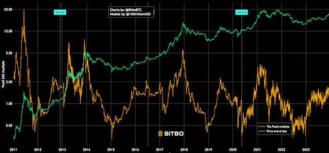
Shows the relation between BTC mined in a day (expressed in USD) and 365 day moving average.
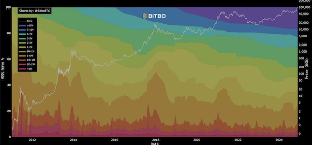
Visualizes the age distribution of Bitcoin's circulating supply over time.
Bitbo's charts section offers a wide range of Bitcoin charts and metrics.
If you have any questions, comments, or feedback please reach out to us via Twitter or via email at info@bitbo.io.