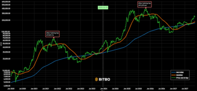
Cycle Repeat
Projection of Bitcoin's price from today's price based on a repeat of previous cycle.
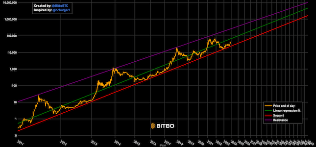
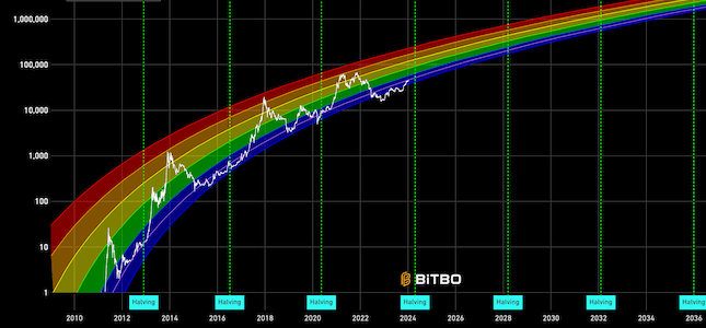
Data & charts updated every hour
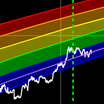
This chart lets you pick a day in bitcoin’s price history and see what the price was at the end of that day as well as how many days have had higher closing prices.
Pick a day on the chart by hovering over it with your cursor. You will see several points of data. You will be given the price at the end of that day and that point will have a color coding. The color coding can be used to gauge how many total days in bitcoin’s price history have had higher closing prices than the day selected. For instance, red represents 500 or more days. Blue represents zero. The colors in between correspond to different numbers of days. The Y axis represents the price of bitcoin and the X axis represents the time since bitcoin started trading.
Bitbo's charts section offers a wide range of Bitcoin charts and metrics.
If you have any questions, comments, or feedback please reach out to us via Twitter or via email at info@bitbo.io.