
Bitcoin Rainbow Chart
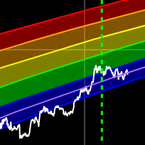
A Bitcoin rainbow chart using only the halving dates as data.
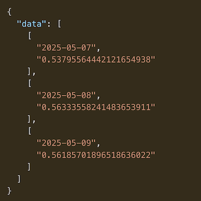
Data & charts updated every hour
This chart shows Bitcoin's price in its current cycle compared to where it was in past cycles.
The red dots indicate when the Bitcoin price made all-time highs.
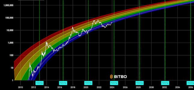
A Bitcoin rainbow chart using only the halving dates as data.
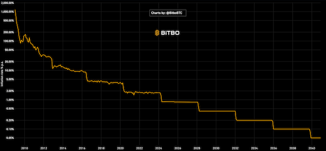
Bitcoin inflation since 2009. For past months, it uses actual BTC supply. For future months, it shows expected inflation.
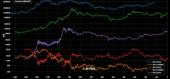
Bitcoin price broken into eras based on halving.
Bitbo's charts section offers a wide range of Bitcoin charts and metrics.
If you have any questions, comments, or feedback please reach out to us via Twitter or via email at info@bitbo.io.