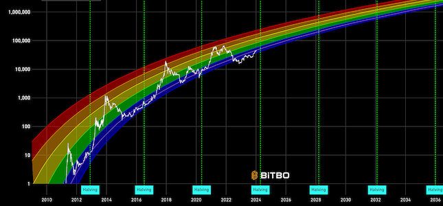
Bitcoin Rainbow Chart
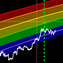
A Bitcoin rainbow chart using only the halving dates as data.
Data & charts updated every hour
| Band | Avg 30d Return | Avg 90d Return | Avg 1y Return | Occurrences |
|---|---|---|---|---|
| Bitcoin Dead | +10.3% | +33.3% | +146.6% | 156 |
| Fire Sale | +7.4% | +24.6% | +193.1% | 614 |
| BUY! | +11.5% | +56.3% | +713.6% | 1431 |
| Accumulate | +3.8% | +24.9% | +375.7% | 1121 |
| Still Cheap | +11.5% | +30.6% | +160.8% | 432 |
| HODL | +10.2% | +30.6% | +72.0% | 517 |
| Is this a Bubble? | +14.7% | +94.1% | +91.4% | 436 |
| FOMO | +23.4% | +3.8% | +47.6% | 266 |
| Sell Seriously | +3.7% | -9.6% | -33.4% | 170 |
| Max Bubble | -13.2% | -18.8% | -56.7% | 82 |
| Above Max Bubble | -10.5% | -34.3% | -63.1% | 89 |
| Band | Days | % of Time |
|---|---|---|
| Bitcoin Dead | 156 | 2.9% |
| Fire Sale | 614 | 11.6% |
| BUY! | 1431 | 26.9% |
| Accumulate | 1121 | 21.1% |
| Still Cheap | 432 | 8.1% |
| HODL | 517 | 9.7% |
| Is this a Bubble? | 436 | 8.2% |
| FOMO | 266 | 5.0% |
| Sell Seriously | 170 | 3.2% |
| Max Bubble | 82 | 1.5% |
| Above Max Bubble | 89 | 1.7% |
| Year | Dead | Fire | BUY! | Acc | Cheap | HODL | Bubble? | FOMO | Sell | Max | Above |
|---|---|---|---|---|---|---|---|---|---|---|---|
| 2012 | 0% | 0% | 40% | 47% | 9% | 4% | 0% | 0% | 0% | 0% | 0% |
| 2013 | 0% | 0% | 6% | 6% | 5% | 10% | 33% | 20% | 5% | 2% | 12% |
| 2014 | 0% | 0% | 0% | 0% | 3% | 18% | 9% | 15% | 32% | 12% | 12% |
| 2015 | 0% | 18% | 50% | 27% | 5% | 0% | 0% | 0% | 0% | 0% | 0% |
| 2016 | 0% | 22% | 75% | 3% | 0% | 0% | 0% | 0% | 0% | 0% | 0% |
| 2017 | 0% | 0% | 27% | 12% | 19% | 16% | 12% | 6% | 3% | 6% | 1% |
| 2018 | 0% | 0% | 7% | 4% | 13% | 30% | 24% | 12% | 6% | 3% | 0% |
| 2019 | 0% | 0% | 29% | 30% | 31% | 10% | 0% | 0% | 0% | 0% | 0% |
| 2020 | 0% | 4% | 39% | 45% | 10% | 3% | 0% | 0% | 0% | 0% | 0% |
| 2021 | 0% | 0% | 0% | 0% | 1% | 38% | 41% | 20% | 0% | 0% | 0% |
| 2022 | 15% | 24% | 17% | 10% | 22% | 13% | 0% | 0% | 0% | 0% | 0% |
| 2023 | 4% | 77% | 19% | 0% | 0% | 0% | 0% | 0% | 0% | 0% | 0% |
| 2024 | 0% | 1% | 49% | 50% | 1% | 0% | 0% | 0% | 0% | 0% | 0% |
| 2025 | 0% | 0% | 27% | 73% | 0% | 0% | 0% | 0% | 0% | 0% | 0% |
| 2026 | 44% | 43% | 14% | 0% | 0% | 0% | 0% | 0% | 0% | 0% | 0% |
Enter a future date to see projected band values based on the V2 rainbow model.
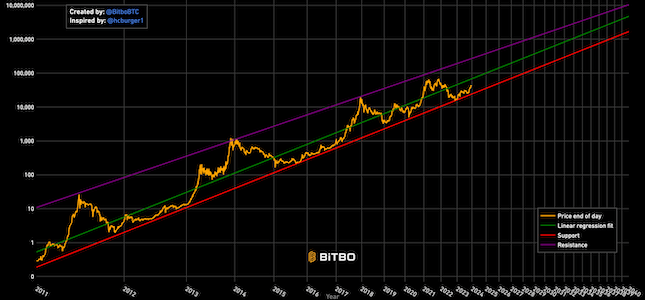
The Bitcoin Rainbow Price Chart originated from a proposal by a user named Trolololo on the Bitcointalk forum in 2014.
The chart above, however, is showing the v2 rainbow chart from Rohmeo from blockchaincenter.net.
The original rainbow chart was designed to estimate Bitcoin's long-term price trend using a logarithmic regression model. The equation for this model is:
10^(3.109106 * ln((number of weeks since 2009 Jan 09)/weeks) - 8.164198)
The colorful bands representing overvaluation and undervaluation areas were introduced by Reddit user azop in August 2014.
The full "Bitcoin Rainbow Chart" model was completed in 2018 by Über Holger, combining Trolololo's logarithmic regression with azop's colorful bands.
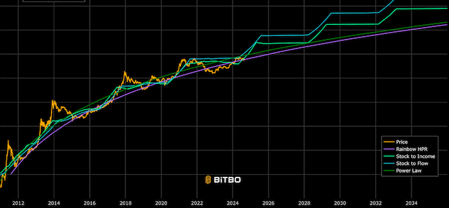
The chart features 8 colored bands overlaying the Bitcoin log price chart, each representing different market conditions. Warmer colors indicate potential selling zones, while cooler colors suggest buying opportunities. The chart also includes 4-year 'halving' markers, representing Bitcoin's supply halving events.
It's important to note that while the Rainbow Chart has been a fun and sometimes insightful way to view long-term price movements, it has no scientific basis. It is simply a meme at this point.
The Bitcoin price has generally remained within these bands, except during notable "bubbles" in 2011, 2014, and 2017.
In 2022, as Bitcoin's price dropped below $20,000, it broke out of the original Rainbow Chart's bands.
Rohmeo from blockchaincenter.net, the chart's maintainer, faced a dilemma.
Instead of letting the chart "die in dignity," he compromised by adding a new violet band to extend the rainbow's range.
This addition preserved the original formula while accommodating lower prices.
However, even this adjustment proved insufficient, leading Rohmeo to develop a V2 version in November 2022.
This update featured a new formula with the original colors to better reflect Bitcoin's evolving price dynamics, demonstrating the chart's adaptability to changing market conditions. This is what is shown above.